|
| Pogled / Der Blick / The View |
Buchstäblich / Literally
Recent Work
by Nina Pops
Die Griechen
betrachten die Sprache in gewissem weiten Sinne optisch, nämlich vom
Geschriebenen her. . . . Die Sprache ist, d.h. sie steht im Schriftbild des
Wortes, in den Schriftzeichen, in den Buchstaben, grammata.
Martin Heidegger, Einführung in die
Metaphysik
I’m sitting before a large painting, 120 x 130 cm, Öl
auf Leinwand, 2009, “Visualisierung des Romans Der Blick von Žarko Radaković.” On my desk are three books
with numbers as titles: 18, 21, and 23, Polychromos Farbstifte auf Papier, 2007-2009.
The painting of the book and the
books of drawings offend my sensibilities. They disturb expectations heavily
influenced by Lessing’s careful distinction in Laokoon between poetry (which extends in time) and painting (which
extends in space). What to make, then, of a painting of the workings of a
novel? How should I understand drawings that require me to see them on
successive (time!) pages?
Der Blick
/ Pogled / The View is a novel. “Der Blick” is a painting of Žarko Radaković’s
novel, published in Belgrade in 2002. The novel is dedicated to Radaković’s
daughter Milica and to his late friend Julije Knifer. The painting is dedicated,
de facto, to Radaković, and, of
course, to Nina Pops’ much admired Julije Knifer. Using manuscript pages of
Radaković’s book Knifer, Nina Pops
once created a remarkable book of collages in which her drawings frame and
underline and probe and question and provoke and celebrate the manuscript in
the context of Knifer’s obsessive and remarkably beautiful white-on-black and
black-on-white “meanders” (see some of the pages at www.ninapops.blogspot.de).
But
back to the distinction between poetry and painting. What does it mean to paint
with a novel in mind? To visualize a novel?
We’re
familiar with novels that include illustrations of given scenes. My 1902
edition of Owen Wister’s The Virginian,
for instance, is vividly illustrated by Arthur I. Keller (“By his side the girl
walking and cheering him forward” or “When you call me that, smile”).
Nina
Pops’s painting, however, given its thoughtful and vivid exploration of colors
and relationships between geometric forms, could never be an illustration of Radaković’s
novel about a troubled year in the life of an employee of a media firm who
gazes down over a city from his office on the twentieth floor of a phallic
building.
Or
could it?
On
her blog, Pops writes: “Ich dokumentiere in Formen alles, was ich erlebe.” What
has she experienced as a reader of the novel?
The
painting pictures no vivacious woman leading a horse bearing a wounded man,
that’s for sure. And there’s no tense scene over a table of cards. But there is
sequence—the movement in time “appropriate” to a written text. I can “read” the
painting as three lines of text: from top left to right and then middle left to
right and then from bottom left to right. Or, given how the top line and middle
line merge as they approach the right “margin,” perhaps the “text” of the
painting might be read from left to right and then back to the left and finally
back to the right.
Does
the blue bracket at the top left represent the first word or first scene or
first character of Der Blick? Is
there, a little less than 1/3 of the way into the novel, reference to a cross,
with additional crosses or perhaps churches appearing twice more in the final
third? Does the novel have a sad ending (dark blues and blacks)? Does it
feature a connection between something soon after the beginning and something
in the second third of the novel, a connection indicated by the dark red finger
that reaches down from the first “line” into the second? Perhaps a character
appears for a second time about this far through the novel, or perhaps a
character enters a bar for a second time, or perhaps a character confronts his
robotic boss a second time.
What does it mean to “document in forms”? If there is a
one-to-one key that would unlock this painting’s secrets, Pops’ visual documentation
might be seen as a kind of sign language, as a simple, if complex, visual
equivalent to the novel. If that’s the case, if that’s all that the painting is
meant to do, this is a work of the same passing interest as the illustrations
of The Virginian. Interesting, but
I’d really prefer the book.
The painting doesn’t feel, however, like an attempt at
equivalence. It strikes me more like a conversation between the forms and
colors of the painting and the forms and sympathies of the written novel,
something like a jazz musician creating her own responses to the chord changes structuring
a given tune.
 Consider a case that moves in the opposite direction,
from painting to poetry. In 1915, Rainer Marie Rilke lived for four months in
the München apartment of his friend Hertha Koenig, to whom he dedicated the fifth
of his Duineser Elegien. Hanging in
the apartment was Picasso’s large “La Famille de Saltimbanques,” a painting
Rilke had recommended that she purchase. The poet was fascinated by the
painting’s acrobats, especially as he remembered the acrobats he had seen rising
and falling on the streets of Paris. The fifth elegy begins with a question
about these acrobats: “Wer aber sind
sie, sag mir, die Fahrenden, diese ein wenig Flüchtigern noch als wir selbst?” The initial answer to the question comes from
Rilke’s idiosyncratic reading of the painting. His eyes traced the outline
around the five standing figures, identifying a capital D, “des Dastehns großer
Anfangsbuchstab.” Who are they then?
Beings who stand there like the
letter D.
Consider a case that moves in the opposite direction,
from painting to poetry. In 1915, Rainer Marie Rilke lived for four months in
the München apartment of his friend Hertha Koenig, to whom he dedicated the fifth
of his Duineser Elegien. Hanging in
the apartment was Picasso’s large “La Famille de Saltimbanques,” a painting
Rilke had recommended that she purchase. The poet was fascinated by the
painting’s acrobats, especially as he remembered the acrobats he had seen rising
and falling on the streets of Paris. The fifth elegy begins with a question
about these acrobats: “Wer aber sind
sie, sag mir, die Fahrenden, diese ein wenig Flüchtigern noch als wir selbst?” The initial answer to the question comes from
Rilke’s idiosyncratic reading of the painting. His eyes traced the outline
around the five standing figures, identifying a capital D, “des Dastehns großer
Anfangsbuchstab.” Who are they then?
Beings who stand there like the
letter D.  Rilke translated the standing group of acrobats into a
Buchstabe / letter, a literal / buchstäbliches image
that he then transflromed into poetry. He was not attempting to describe the
painting in words. Rather, he “read” and used the painting for purposes of
poetry.
Rilke translated the standing group of acrobats into a
Buchstabe / letter, a literal / buchstäbliches image
that he then transflromed into poetry. He was not attempting to describe the
painting in words. Rather, he “read” and used the painting for purposes of
poetry.
Looking at Nina Pops’ painting through Rilke’s eyes, I
can find angular C’s, a W or two, several T’s and t’s (rather than the crosses
I initially saw), several E’s, and a U. She is, after all, responding to a Buch/book
written with Buchstaben/letters and it’s only to be expected that I find
Buchstaben in the painting. There was a time in the hieroglyphic history of
alphabet letters and in the runic history of Buchstaben scratched into a Buche/beech
that letters were no mere abstractions used for writing but drawings of a door
or a steer’s head or an eye used also to mean a variety of other things whose
words also began with the same sound as “door” or “head.”
 Perhaps, then, Pops is riffing on the forms of the
letters Radaković uses to write his words. Perhaps any large array of
geometrical forms will include forms that resemble letters. Or perhaps each individual
form is a response to a character, an incident, a scene, a phrase of the novel—in
their formal and chromatic connections laying out patterns of relationship,
doing so in space rather than in time. Perhaps Pops has painted the forms of her
experience with the story rather than the story itself.
Perhaps, then, Pops is riffing on the forms of the
letters Radaković uses to write his words. Perhaps any large array of
geometrical forms will include forms that resemble letters. Or perhaps each individual
form is a response to a character, an incident, a scene, a phrase of the novel—in
their formal and chromatic connections laying out patterns of relationship,
doing so in space rather than in time. Perhaps Pops has painted the forms of her
experience with the story rather than the story itself.
The
relationship between book and painting is heightened by the name of the novel: Pogled / Der Blick / The View.
Paintings should be about views, novels about events and characters. This novel
is about a view. This painting is about events. And it’s on that richly
troubled ground that the two works of art meet so precipitously and so
providentially.
I
turn to the three books of drawings, numbers 18, 21, and 23. Why has Nina Pops
drawn these forms in sequence (24.10.2008—22:15, 24.10.2008—23.08,
24.10.2008—23:50, and so on? Because the book requires that? Or has she chosen
the book to make that possible?
 The
successive images of the book are experienced by a reader in time, the realm of
poetry rather than painting. The sequence of forms—the noted times of creation as
well as the succession from page to page—tells a story (as do the notations of
time in Radaković’s novel—26.11.1996, 27.11.1996, 28.11.1996 etc.).
The
successive images of the book are experienced by a reader in time, the realm of
poetry rather than painting. The sequence of forms—the noted times of creation as
well as the succession from page to page—tells a story (as do the notations of
time in Radaković’s novel—26.11.1996, 27.11.1996, 28.11.1996 etc.).  Julije
Knifer’s paintings also tell stories, depicting, as the name “meander” suggests,
a flow from one point to another. As I think of Nina Pops’ forms in that
context, I see a key difference. She seems to be interested in relationships
rather than flow (the flow, in her case, appears as a “reader” of the books moves
from page to page, from form to form). Rather than Knifer’s single black form
on white or white on black, rather than the single image removed from
Malewitsch’s black square only by the inflected flow of the meander, Pops works
with two separate forms, or three or four forms, exploring how they relate with
one other.
Julije
Knifer’s paintings also tell stories, depicting, as the name “meander” suggests,
a flow from one point to another. As I think of Nina Pops’ forms in that
context, I see a key difference. She seems to be interested in relationships
rather than flow (the flow, in her case, appears as a “reader” of the books moves
from page to page, from form to form). Rather than Knifer’s single black form
on white or white on black, rather than the single image removed from
Malewitsch’s black square only by the inflected flow of the meander, Pops works
with two separate forms, or three or four forms, exploring how they relate with
one other.  What happens when two forms mirror one another? When
one form penetrates another? When one form embraces another, encloses another?
When one form weighs heavy on another? When forms fit one another like
intricate pieces of a puzzle? When one form frames another? When forms separate
on a page? When they return to snuggle with one another? When a black form
meets a grey one, a red form encounters a pink one? When vertical forms are
disturbed by horizontal forms? When a foot enters a mouth?
What happens when two forms mirror one another? When
one form penetrates another? When one form embraces another, encloses another?
When one form weighs heavy on another? When forms fit one another like
intricate pieces of a puzzle? When one form frames another? When forms separate
on a page? When they return to snuggle with one another? When a black form
meets a grey one, a red form encounters a pink one? When vertical forms are
disturbed by horizontal forms? When a foot enters a mouth?
When
a foot enters a mouth? The discussion of geometric relationships morphs into a discussion
of human relationships, just as the novel of human relationships was transmuted
into geometric forms.
Nina
Pops has produced, at least for me, Gestalt psychology of the finest sort.
Buchstäblich.
[see more of her work HERE]
[see the actual, as opposed to virtual, work —
[see more of her work HERE]
[see the actual, as opposed to virtual, work —
Kulturebunker, Köln
01.11.2012 - 11.11.2012
Nina Pops Strothotte - "Querschnitt"
In der Ausstellung "Querschnitt" zeigt die Künstlerin Nina Pops Strothotte Zeichnungen, Bilder und Bücher aus der Serie "Formen", sowie das Bild "Der Blick", Visualisierung des gleichnamiges Buches von Schriftsteller Zarko Radakovic.
Vernissage: 1.11.2012, 18.00 Uhr.
Um 19.00 Uhr liest Schriftsteller Zarko Radakovic aus dem Buch "Der Blick" vor.
Um 19.00 Uhr liest Schriftsteller Zarko Radakovic aus dem Buch "Der Blick" vor.
Öffnungszeiten: 2.11.2012 bis 4.11.2012, 14.00 bis 19.00 Uhr, danach nach Vereinbarung unter 0171 7753856
 |
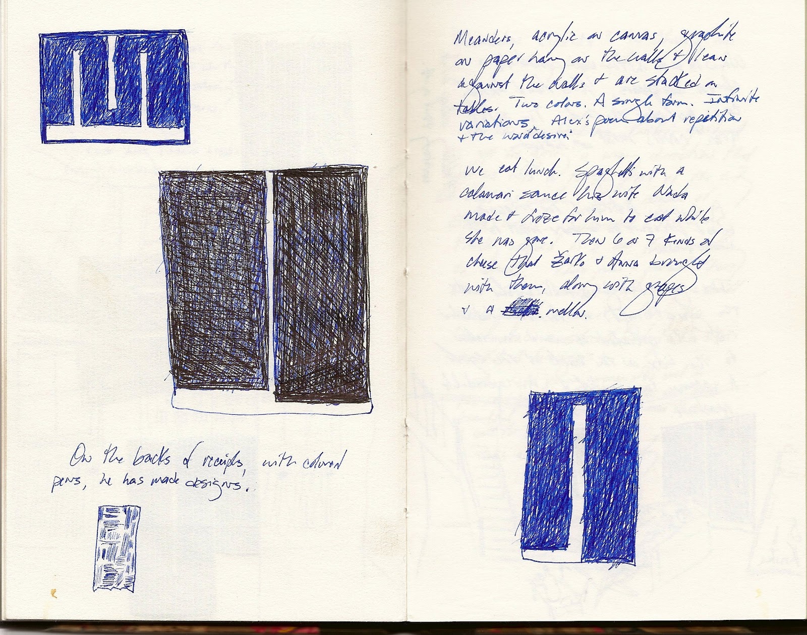
| Alex Caldiero, from Or: Book O' Lights |
Scott Abbott
Woodland Hills, Utah
20 October 2012
Here the text read by Zarko Radakovic from his novel Der Blick at the opening of the exhibition.
Sonntag, 8.9.1996
Bleiernes Wetter. Das Bild erstarrt. Es ist zu wenig klar für echten Frost. Es ist zu wenig unklar, um die Besinnung zu verlieren. Die Ziegel auf dem Fabrikschornstein sind mehr feucht als kalt. Die Zweige im Park sind schwer vom kommenden Regen. Das Bild ist heute eine Frottage, an der das Auge des Betrachters klebt. Denn eine Frottage ist ein Quell von Farben. Sie ist die Plazenta für künftiges Leben. Sie ist der Keim des Sehens. Sie ist die Wahrheit, bevor man in den Schlaf versinkt. Sie ist der Uranfang. Ruhen. Sammeln. Der Augenblick der Verbundenheit mit allen Zeitbestimmungen. Vor allem ein Aufbruch in optische Perspektiven. (Unvergesslich sind die Alleen auf dem Weg ins Gefängnis von Padinska Skela in Serbien: Die Äste verbanden sich in der Ferne tatsächlich zum Tempelbau der Freiheitsschule, ohne die wir uns nicht einmal des Geschmackes von Nahrung, von Wasser, noch des Duftes der Freiheit bewusst wären.) Kein einziger Zug hat heute Farbe. Kein einziges Haus hebt sich farblich vom Himmel ab. Und auch die Baumwipfel in den Parks, in den Höfen, den Avenuen und Straßen verfügen nicht über die betäubende Glut des bevorstehenden Aufschlitzens, mit kirrenden Klingen, über die Brüste, den Penis, das Herz, die Klitoris; sie schnitten in das Weiße der Augen, hinter denen das Bewusstsein, ganz aufgeregt, tanzte, zur Musik der Zeit und mit beschleunigtem Atem. Heute starren die Augen in die Leere, umschattet von den Konturen des Bilduntergrunds. Das Hallengebäude erscheint wie ein gelblicher Streifen. Was ist wohl in seinem Inneren? Ein Mann an einem Tisch, das Hemd offen, verschwitzt, schmutzig, die Augen weit aufgerissen, eine Reflektorlampe auf das Gesicht gerichtet; der Schatten verbirgt seine Augenringe; über der Oberlippe Schweißperlen? Am Fenster des Hauses vor der Halle schwingt ein Vorhang; vor dem Triptychonfenster des Hauses in den Baumwipfeln zwischen Halle und dem Gebäude mit dem Fenster mit dem Vorhang: eine Frau und ein Mann: sie sitzen beim Frühstück; auf dem Platz vor dem Bahnhof manövriert ein riesiger Lastkraftwagen. Wohin führt wohl die Straße zwischen dem Fabrikschornstein und dem Kirchlein unterhalb der größeren Kirche, die, wenn man sich Verbindungslinien mit der Kathedrale, der größeren Kirche und der doppeltgehörnten Kirche denkt, einen Rhombus beschreibt? Was denkt wohl der Mann, der, seitdem dieser Teil des Textes begonnen wurde zu schreiben, vor der Garage eines fensterlosen Gebäudes am Ende der Straße steht? Wieder zieht ein Zug vorüber. Jetzt sind da kaum bemerkbare Nuancen von Blau in der Farbe der Waggons. Die Aufschrift auf dem Tank ist deutlich zu sehen. Da kommt ein zweites Güterfahrzeug: Es ist ein LKW mit zwei Anhängern: Er fegt durch die enge Straße: Er ist riesig: Gleich wird er einen Baum aus der Allee auf der linken Seite umfahren: Gleich wird er die hervorstehenden Teile der Fassade des Hauses auf der linken Seite schneiden: Gleich wird er auf die breite, viel befahrene Straße kommen, die quer durch die Stadt führt: Mit dem Autobus, der gerade vor einer Haltestelle bremst, wird er nicht zusammenstoßen: Den Mann und die Frau, die vor einem Imbissstand stehen und schweigend Bürek essen, wird er nicht überfahren: Mit dem Zeitungs- und Tabakwarengeschäft am Rande des ersten größeren Platzes wird er nicht kollidieren: Er wird nur die Straßenbahn auf dem zweiten größeren Platz ganz leicht streifen (Die Passanten werden sich umdrehen und „Achtung!“ rufen): Der LKW wird durch eine Pfütze am Rande des Platzes „schießen“ und einen Mann in weißem Anzug und mit weit aufgeschlagener Zeitung bespritzen: Der LKW wird unter dem Viadukt hindurchrasen, der Auspuff wird am Oberteil der Karosserie abbrechen: Das Dach des Anhängers wird sich verbiegen: Er wird sich auf die eine und dann auf die andere Seite verkrümmen: Er wird über ein Schlagloch springen: Er wird sich wie eine Spirale einrollen, sich jählings verbiegen, sich zusammenballen wie eine Bombe, sich der Länge und der Breite nach wie eine Ziehharmonika auseinanderziehen, drei Mal kurz knallen, zum Stillstand kommen, plötzlich, die Hymne des Erstligisten der Stadt ansingen, anstoßen und ein „Glas Bier“ auf ex austrinken. Und dann – dann werden die ersten Sonnenstrahlen durch die Wolken brechen. Über die Stadt wird sich fröhlicher, warmer, heller Dampf legen, in den die Vögel hinein- und aus dem schallendes Gelächter herausfliegen wird. Das Bild wird zu vibrieren beginnen. In allen Töpfen in allen Küchen aller Wohnungen wird das Wasser gleichzeitig zu sieden beginnen. In allen Radiatoren in allen Wohnungen wird man ein Klopfen hören, drei Mal, gleichzeitig. Zugleich wird über allen WC-Schüsseln in allen Wohnungen in der Stadt die Wasserspülung betätigt werden. Die Dauer des Wasserflusses in den WC-Schüsseln in allen WCs aller Wohnungen wird ganz, ganz unterschiedlich lang sein. Auch die Geräusche des Wassers beim Herausfließen aus den Wasserbehältern in den WCs der Wohnungen in der Stadt werden aus unterschiedlichen Tönen bestehen. Es beginnt eine „großartige Vielfalt“. Alles wird aufleben. Die Waggons des Zuges, der dann vorbeifahren wird, werden die Farben des Regenbogens tragen.
(Deutsch: Helmut Weinberger)